library(palmerpenguins)

counts <- table(penguins$species)
counts
   Adelie Chinstrap    Gentoo
152 68 124 barplot(counts)
Here we will briefly describe the code used to generate some common plots used when vusualizing data.
The plots shown in these notes otherwise were created using ggplot. Creating plots using ggplot is not something we have time to cover in this course, but is great for creating high quality plots. If interested please check out the following free book.
Here we will work through some code to create plots in what is known as base R. This is a quicker way to create simple plots, and can also be used to create complex figures if required.
We can easily create a barplot of the species of the penguin data. We first need to aggregate the data, counting how many penguins there are of each species. This is done using the table function, before using the barplot function with the count data.
library(palmerpenguins)
counts <- table(penguins$species)
counts
Adelie Chinstrap Gentoo
152 68 124 barplot(counts)
We can use the hist function to create a histogram of a continuous variable. Note that most plots automatically add a title and axes labels (i.e, penguin$bill_length_mm under the histogram). We will see how to change this shortly.
hist(penguins$bill_length_mm)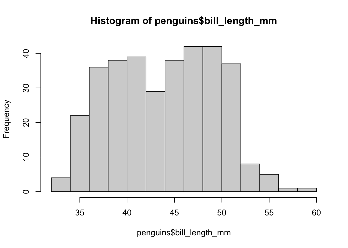
Scatterplots use the default plot function, with the first argument being the x variable and the second being the y variable.
plot(x = penguins$bill_length_mm,
     y = penguins$bill_depth_mm)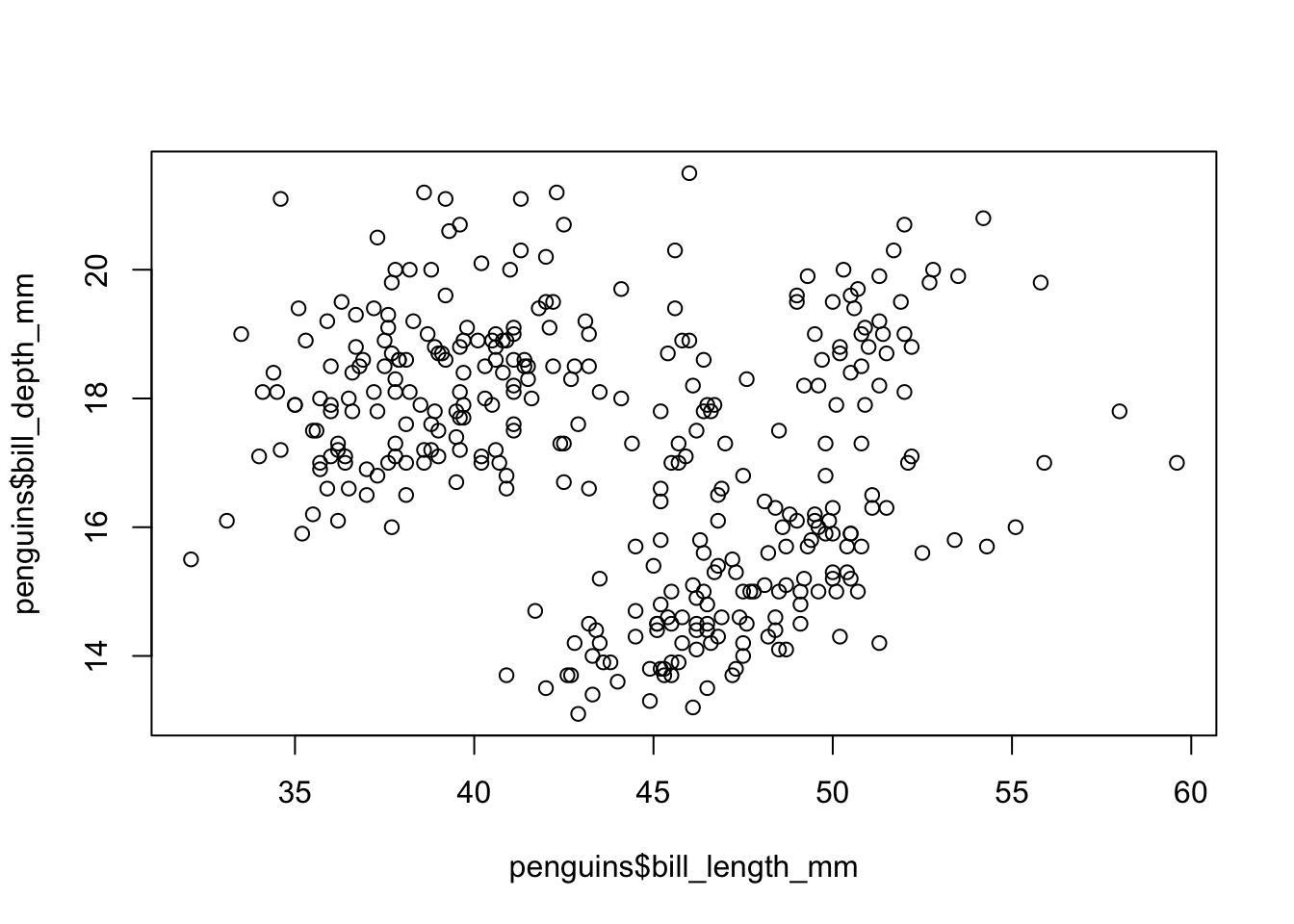
Often we want to compare a continuous variable across two or more categories. A boxplot is a great way to do that, and can be created with the boxplot function.
boxplot(bill_length_mm ~ species, data = penguins)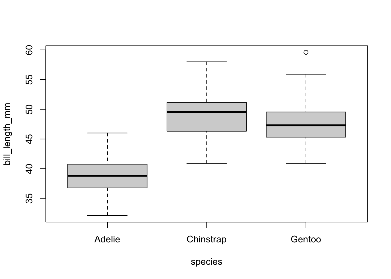
Here we write boxplot(var1 ~ var2), where var1 is the continuous variable and var2 is the categorical variable. We then specify the dataframe the data is coming from.
For each variable, the boxplot shows:
This can be useful for examining the spread of continuous variables across different groups, and seeing if they are approximately similar.
We can add colour to this scatterplot by using the col argument also, however it doesn’t specify what colour is for what categories. Adding a legend to show this is a bit more complicated.
plot(x = penguins$bill_length_mm,
     y = penguins$bill_depth_mm,
     col = penguins$species)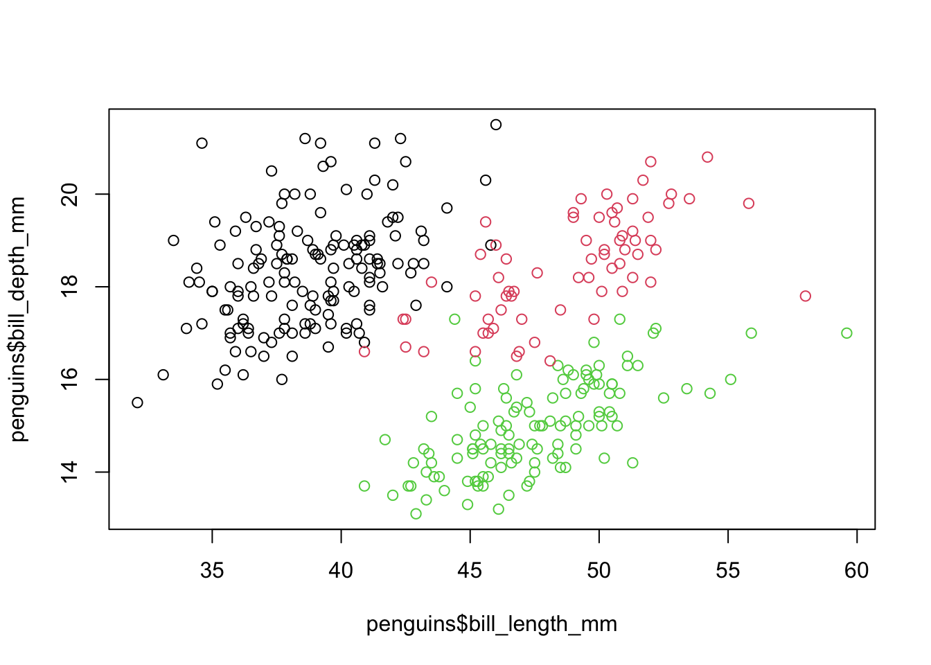
# we know each colour is a different species but no legend to
# say which is whichWe can add or change the titles of these plots. This can be done by specifying arguments inside the function which created the plot. Common options are:
main to change or set a title.xlab to change the label for the x-axisylab to change the label for the y-axisFor example, suppose we want to change the title for the above histogram. To do that we just add the main argument.
hist(penguins$bill_length_mm, main = "A new title")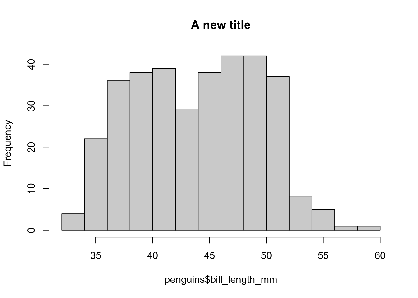
Similarly, we can change the labels on the axes in the same way.
hist(penguins$bill_length_mm, main = "A new title",
     xlab = "New x axis label",
     ylab = "New y axis label")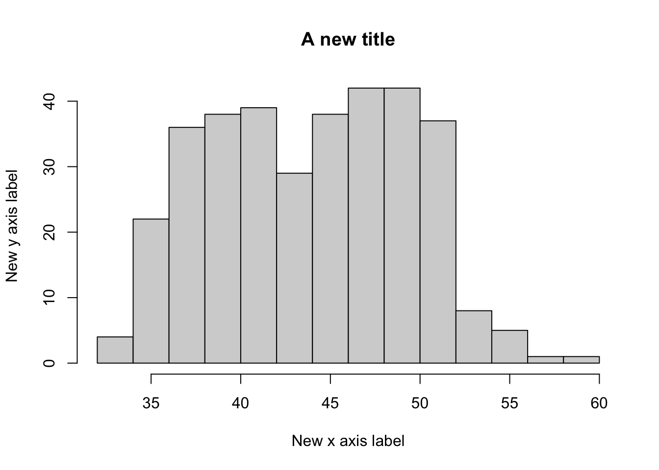
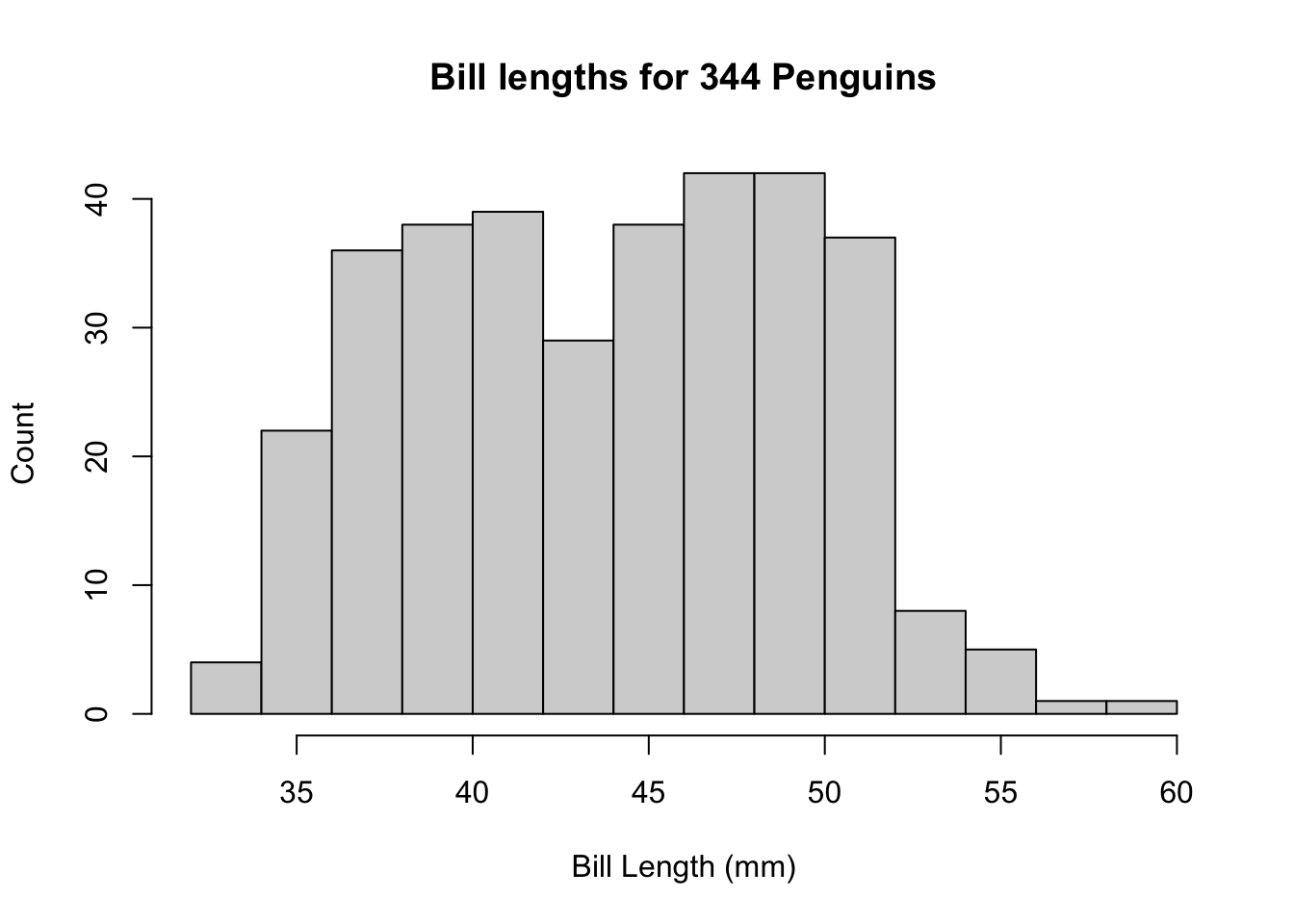
In general, these should be used to make your plot labels and titles informative! For example, here is one way you could make this histogram.
hist(penguins$bill_length_mm, main = "Bill lengths for 344 Penguins",
     xlab = "Bill Length (mm)",
     ylab = "Count")